 |
| Large Salad Bowl Form by Weston Neil Andersen: 10 inches diameter copyright Andersen Design 1970 |
 |
| Prototype of Form before lip was adjusted |
The Large Salad Bowl with the two tones of blue leaves has been around for a long time. All the while I thought it was a beautiful decoration done on a bowl which had warped in the casting.
 |
| lip comparison |
Observed side by side with another bowl it is obvious that there is no warping in the globe of the bowl. The blue flower bowl, shown from the back side, is the one on the right in the picture. Both bowls have perfectly formed globes. It is only the curve of the rim line which is different. This revelation identifies the blue leafed tree bowl as an original prototype which was cast and found unsatisfactory and so the form design was reworked, reshaping the curve of the cut-out lip.
 |
| The correct curve of the lip
|
 |
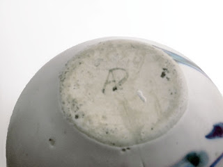
| The Working prototype is signed with capitalized letters spelling ANDERSEN, written in sgraffito |
The bowl to the left is a vintage large salad bowl, ten inches in diameter The bowl is decorated with artistry characteristic of Brenda’s work.
The execution of the form was problematic. The bowl was cast too thick and should have been tossed back into the slip tank to be reprocessed, but sometimes, in a moment of weakness, the slip-caster can’t bring themselves to do that and instead tries to fix it by thinning the curved lip of the bowl, causing a visible ridge along the rim as the thinned lip meets the heavy cast of the body. The bowl cracked during firing but the crack does not go all the way through the bowl and it holds liquid.
The decoration of the bowl is perfectly executed in the first instant without any re-dos or touch ups giving the hand execution of the pattern an elegant and natural beauty expressing the inner confidence of the artist. The leaves have a crisp outline which requires a perfectly balanced white glaze and a perfectly adjusted decorating color. The former is done by the glaze maker and the latter is in the hands of the decorator, who must pay attention daily to the balance of the decorating colors. A talented decorator will develop an intuitive awareness through practice, but it is always about the relationship between the glaze and the decorating color.
The bowl is shown in the picture below with another bowl, also decorated by Brenda. The second bowl is a better cast. The decoration is charming with exuberance, despite the leaves not being as crisp as the leaves are in this bowl.
The bowl on the right is cast to a perfect thinness. There is room for it to go even thinner but it is fine at this thickness and adds strength against breakage without making the bowl heavy in weight.
This bowl is decorated by Brenda. It is signed on the bottom in an unusual way. with the name ANDERSEN DESIGN written out in capital letters. This suggests that it might have been created during the prototype process, but that is not certain.


